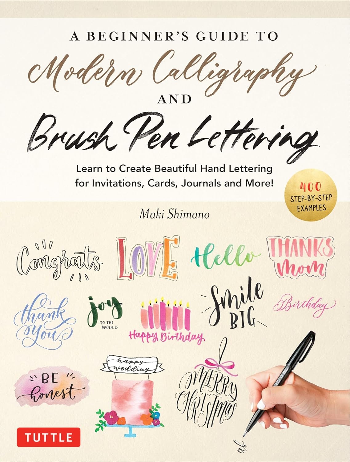
A beginner’s guide to lettering and modern calligraphy is your comprehensive guide to mastering this beautiful art form, offering step-by-step instructions, practice exercises, and inspiring ideas, enabling you to craft personalized cards, invitations, and artwork while exploring creative typography and hand lettering techniques. Conduct.edu.vn provides a wealth of resources for refining your skills and exploring new lettering styles. Discover the world of brush lettering, faux calligraphy and more.
1. Unveiling the Art of Lettering and Modern Calligraphy
Lettering and modern calligraphy are experiencing a renaissance, captivating people from all walks of life with their elegance and versatility. But what exactly are they, and what makes them so appealing? Let’s delve into the definitions, explore the differences, and understand why these art forms have become so popular.
1.1 Defining Lettering and Modern Calligraphy
- Lettering: The art of drawing letters. It is an illustrative technique where each letter is consciously designed and crafted, often with variations in style and form. Lettering is more about the composition and overall visual appeal of the words rather than the act of writing them.
- Modern Calligraphy: A contemporary take on traditional calligraphy. It emphasizes freedom and creativity, allowing for variations in stroke thickness, letterforms, and embellishments. Unlike traditional calligraphy, which adheres to strict rules, modern calligraphy encourages experimentation and personal expression.
1.2 Lettering vs. Modern Calligraphy: Key Distinctions
While both lettering and modern calligraphy involve creating beautiful letterforms, there are key differences:
| Feature | Lettering | Modern Calligraphy |
|---|---|---|
| Technique | Drawing letters | Writing letters with varying stroke thickness |
| Tools | Pencils, pens, markers, digital tools | Brush pens, pointed pens, broad-edged pens |
| Stroke Variation | Achieved through layering and deliberate drawing | Achieved through pressure and release on the pen |
| Rules | More flexible, allowing for diverse styles and embellishments | Some fundamental strokes, but encourages personal expression |
| Focus | Visual composition and artistic expression | Rhythm, flow, and the dance between thick and thin strokes |
| Corrections | Easy to erase and redraw | More challenging to correct, requires practice and control |
| Examples | Hand-drawn logos, posters, illustrations, typographic designs | Wedding invitations, personalized cards, inspirational quotes, journal entries |
| Learning Curve | Can be easier for beginners due to the forgiving nature of the tools | Requires practice to master pressure control and achieve consistent strokes |
| Purpose | Creating unique and visually appealing word art | Adding a personal and elegant touch to written communication |
| Process | Often involves sketching, refining, and adding details | Focuses on the continuous flow of writing, with variations in pressure creating the characteristic thick and thin strokes. |
| Versatility | Highly versatile, adaptable to various styles and applications | Offers a wide range of styles, from elegant and formal to playful and whimsical. Often used in event stationery, art prints and home décor. |

1.3 Why Learn Lettering and Modern Calligraphy?
The popularity of lettering and modern calligraphy stems from their ability to add a personal and artistic touch to various aspects of life. Whether it’s creating custom invitations, designing unique logos, or simply expressing oneself through creative writing, these art forms offer numerous benefits:
- Creative Expression: Lettering and modern calligraphy provide a canvas for expressing your unique style and personality.
- Mindfulness and Relaxation: The focused practice of these art forms can be a meditative and relaxing activity, helping to reduce stress and improve focus.
- Personalized Gifts: Handmade cards, personalized artwork, and custom stationery make thoughtful and cherished gifts.
- Professional Opportunities: Lettering and calligraphy skills are valuable in graphic design, branding, event planning, and other creative fields.
- Improved Hand-Eye Coordination: The precise movements required in these art forms enhance hand-eye coordination and fine motor skills.
- Enhanced Creativity: Exploring different styles, tools, and techniques sparks creativity and encourages experimentation.
- Unique Branding: Custom lettering and calligraphy can add a distinctive touch to your brand identity.
By understanding the definitions, distinctions, and benefits of lettering and modern calligraphy, you’re well-equipped to embark on your artistic journey. Conduct.edu.vn offers additional resources and guidance to help you further explore these captivating art forms.
2. Essential Tools and Materials for Beginners
Embarking on your lettering and modern calligraphy adventure requires the right tools and materials. Choosing quality supplies can make a significant difference in your learning experience and the final results of your work. Here’s a comprehensive guide to the essential tools and materials for beginners:
2.1 Brush Pens
Brush pens are the cornerstone of modern calligraphy, offering versatility and ease of use. They come in various sizes, styles, and ink types, each with unique characteristics:
- Small Brush Pens: Ideal for beginners due to their control and precision. Popular options include Tombow Fudenosuke, Pentel Fude Touch Sign Pen, and Zebra Mildliner Brush Pens.
- Large Brush Pens: Offer bolder strokes and are suitable for larger projects. Common choices include Tombow Dual Brush Pens, Karin Brushmarker Pro, and Ecoline Brush Pens.
- Water-Based Ink: Easy to blend and work with, making them perfect for beginners. They are less permanent and can be reactivated with water.
- Pigment Ink: Waterproof and fade-resistant, providing more permanent results. They are ideal for projects that need to withstand the test of time.
- Dual-Tip Brush Pens: Feature a brush tip on one end and a fine tip on the other, offering versatility for both calligraphy and lettering.
When selecting brush pens, consider the size of the tip, the type of ink, and the overall feel of the pen in your hand. Experiment with different brands to find the ones that best suit your style and preferences.
2.2 Paper
The type of paper you use can significantly impact the performance of your brush pens and the overall appearance of your lettering. Here are some recommended paper types:
- Smooth Paper: Essential for preventing brush pen tips from fraying. Brands like Rhodia, Clairefontaine, and HP Premium Choice Laserjet Paper are excellent choices.
- Tracing Paper: Useful for practicing letterforms and tracing guidelines.
- Watercolor Paper: Suitable for blending water-based inks and creating watercolor effects.
- Cardstock: Ideal for creating cards, invitations, and other projects that require a sturdier paper.
Avoid using rough or textured paper, as it can damage the delicate tips of brush pens. Invest in quality paper to ensure smooth strokes and prevent ink bleed.
2.3 Pencils and Erasers
Pencils and erasers are essential for sketching guidelines, planning compositions, and correcting mistakes.
- Pencils: Use a light pencil (2H or HB) for sketching guidelines that can be easily erased.
- Erasers: Opt for a kneaded eraser or a white plastic eraser for clean and precise erasing.
2.4 Rulers and Guidelines
Rulers and guidelines are crucial for maintaining consistent letter heights, baselines, and spacing.
- Rulers: Use a clear ruler for measuring and drawing straight lines.
- Graph Paper: Provides built-in guidelines for practicing letterforms and maintaining consistency.
- Printable Guidelines: Download and print custom guidelines for various lettering styles.
2.5 Other Useful Tools
In addition to the essential tools, consider these helpful additions to your lettering kit:
- Blending Palette: Use a non-porous surface for blending water-based inks.
- Water Brush: A refillable brush pen that allows for easy blending and watercolor effects.
- Fineliner Pens: Ideal for adding details and outlines to your lettering.
- Calligraphy Nibs: Oblique holders and nibs offer traditional pointed pen calligraphy experience.
- Inks: Explore various colors and brands, such as sumi, iron gall and acrylic inks.
- Light Box: Assists in tracing and refining letterforms.
- Storage: Keep your pens and materials organized in a case or container.
By gathering the right tools and materials, you’ll be well-prepared to embark on your lettering and modern calligraphy journey. Remember to choose quality supplies that feel comfortable to use and suit your artistic style. Conduct.edu.vn offers more in-depth reviews and recommendations for various tools and materials.
3. Mastering the Basic Strokes
Before diving into letterforms and complex compositions, it’s essential to master the basic strokes that form the foundation of lettering and modern calligraphy. These strokes, when combined and refined, create the elegant and flowing letters characteristic of these art forms.
3.1 Understanding the Basic Strokes
The fundamental strokes in modern calligraphy are:
- Upstroke (Thin Stroke): Apply light pressure on the pen, creating a thin line as you move upwards.
- Downstroke (Thick Stroke): Apply firm pressure on the pen, creating a thick line as you move downwards.
- Oval: A curved stroke that forms the basis of many letters, such as “o,” “a,” and “d.”
- Underturn: A curved stroke that starts with a downstroke and transitions into an upstroke, forming the bottom of letters like “u” and “w.”
- Overturn: A curved stroke that starts with an upstroke and transitions into a downstroke, forming the top of letters like “n” and “m.”
- Compound Curve: A combination of an overturn and an underturn, creating a flowing, wave-like stroke.
3.2 Practicing the Strokes
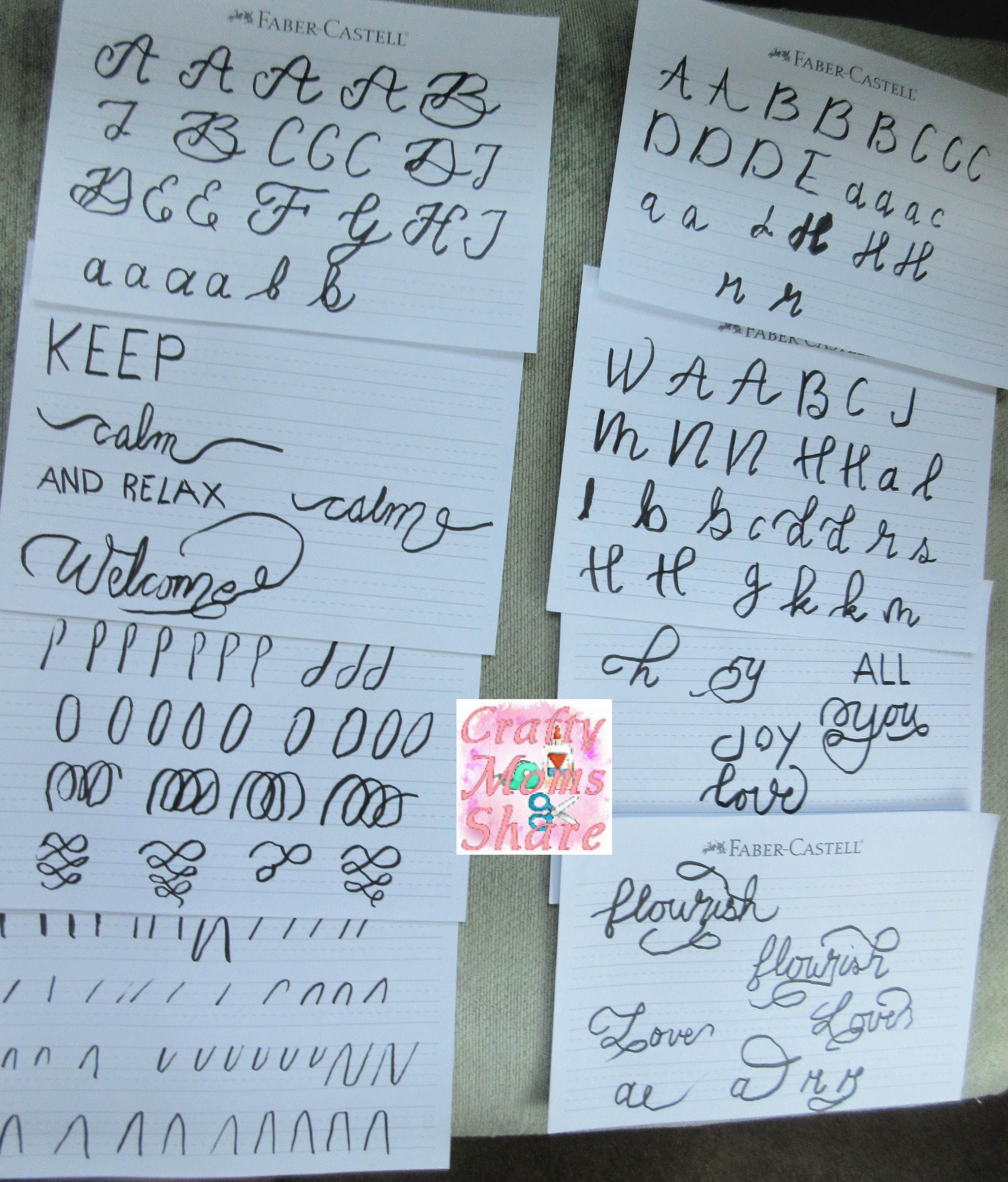
Consistency and control are key to mastering the basic strokes. Here’s a step-by-step guide to practicing:
- Prepare Your Materials: Gather your brush pen, smooth paper, and guidelines.
- Warm-Up: Start with simple line exercises to get a feel for the pen and pressure.
- Upstrokes: Practice drawing thin lines by applying light pressure and moving the pen upwards. Focus on maintaining a consistent thickness.
- Downstrokes: Practice drawing thick lines by applying firm pressure and moving the pen downwards. Aim for a smooth and even stroke.
- Ovals: Practice drawing ovals in various sizes and orientations. Focus on maintaining a consistent shape and smooth curves.
- Underturns and Overturns: Practice these curved strokes, paying attention to the transition between thick and thin lines.
- Compound Curves: Combine overturns and underturns to create flowing, wave-like strokes.
Practice these strokes repeatedly, focusing on consistency, control, and smooth transitions. As you become more comfortable, experiment with varying the pressure and speed to create different effects.
3.3 Tips for Success
- Hold the Pen Correctly: Hold the pen at a 45-degree angle for optimal stroke variation.
- Maintain Consistent Pressure: Apply consistent pressure on downstrokes and light pressure on upstrokes.
- Use Your Arm, Not Your Fingers: Engage your arm and shoulder muscles for smoother and more controlled strokes.
- Practice Regularly: Dedicate time each day to practice the basic strokes. Consistency is key to improvement.
- Refer to References: Study examples of well-executed strokes and compare your work to these references.
- Be Patient: Mastering the basic strokes takes time and practice. Don’t get discouraged if you don’t see results immediately.
By diligently practicing the basic strokes, you’ll develop the muscle memory and control necessary to create beautiful letterforms and elevate your lettering and modern calligraphy skills. Conduct.edu.vn offers video tutorials and downloadable practice sheets to further assist you in mastering these essential strokes.
4. Constructing Letterforms: A Step-by-Step Guide
With the basic strokes mastered, it’s time to apply them to construct letterforms. This section provides a step-by-step guide to creating both uppercase and lowercase letters in modern calligraphy.
4.1 Understanding Letter Anatomy
Before constructing letterforms, it’s helpful to understand the anatomy of a letter:
- Ascender: The part of a lowercase letter that extends above the x-height (e.g., “b,” “d,” “h”).
- Descender: The part of a lowercase letter that extends below the baseline (e.g., “g,” “j,” “p”).
- X-Height: The height of the main body of a lowercase letter (e.g., “a,” “c,” “e”).
- Baseline: The line on which the base of the letters sits.
- Cap Height: The height of uppercase letters.
- Stroke: A line used to form a letter.
Understanding these components will help you maintain consistency and proportion in your letterforms.
4.2 Constructing Lowercase Letters
Here’s a step-by-step guide to constructing lowercase letters in modern calligraphy:
- Start with Guidelines: Draw guidelines for the baseline, x-height, ascender, and descender.
- Identify the Basic Strokes: Determine which basic strokes are used to form the letter.
- Practice Each Stroke Individually: Practice each stroke separately before combining them to form the letter.
- Connect the Strokes: Connect the strokes smoothly and seamlessly, paying attention to the transitions between thick and thin lines.
- Maintain Consistent Slant: Maintain a consistent slant throughout the letter.
- Adjust and Refine: Make any necessary adjustments to improve the shape and proportion of the letter.
Example: Constructing the Letter “a”
- Oval: Start with an oval, applying consistent pressure for a smooth curve.
- Underturn: Add an underturn to the right side of the oval, transitioning from a thick downstroke to a thin upstroke.
- Connect: Connect the underturn to the oval, ensuring a smooth transition.
- Refine: Adjust the shape and proportion of the “a” as needed.
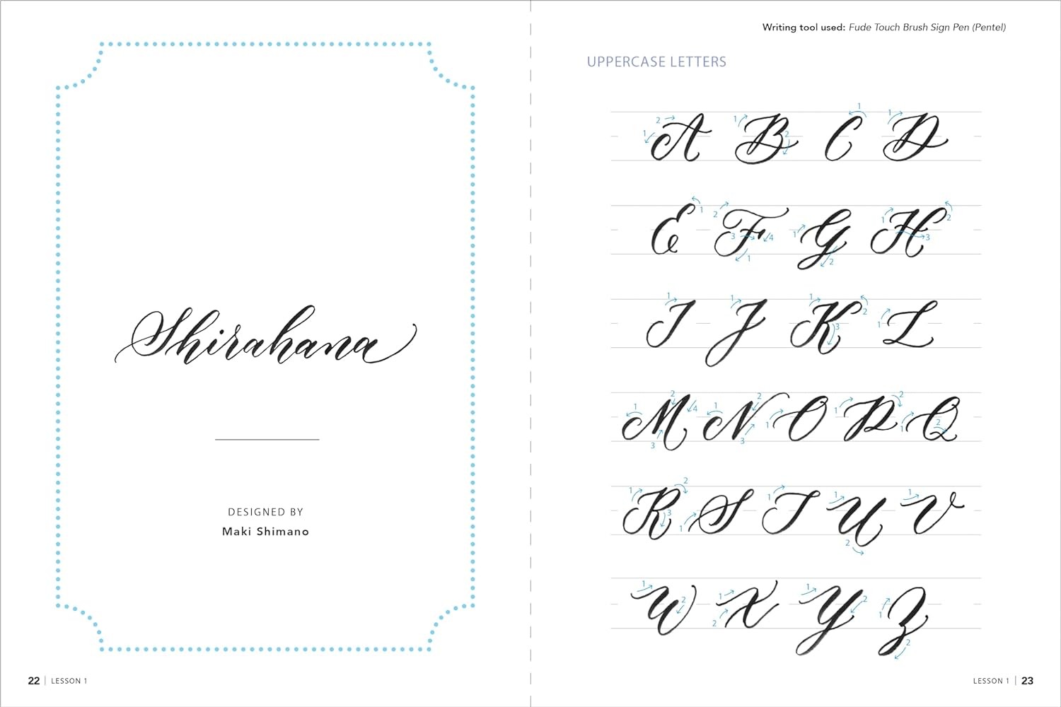
4.3 Constructing Uppercase Letters
Uppercase letters offer more freedom and variation in style. Here’s a general approach to constructing uppercase letters:
- Start with Guidelines: Draw guidelines for the baseline and cap height.
- Choose a Style: Select a style for your uppercase letters (e.g., classic, modern, flourished).
- Identify the Basic Strokes: Determine which basic strokes are used to form the letter.
- Practice Each Stroke Individually: Practice each stroke separately before combining them to form the letter.
- Connect the Strokes: Connect the strokes smoothly and seamlessly, paying attention to the transitions between thick and thin lines.
- Add Embellishments: Add embellishments, such as swashes or flourishes, to enhance the visual appeal of the letter.
- Maintain Consistent Slant: Maintain a consistent slant throughout the letter.
- Adjust and Refine: Make any necessary adjustments to improve the shape and proportion of the letter.
Example: Constructing the Letter “A”
- Downstroke: Start with a thick downstroke, applying firm pressure.
- Upstroke: Add a thin upstroke that intersects the downstroke at the top.
- Crossbar: Add a horizontal crossbar in the middle, connecting the two strokes.
- Embellish: Add a swash to the top of the “A” for a more elegant look.
- Refine: Adjust the shape and proportion of the “A” as needed.
4.4 Tips for Success
- Practice Regularly: Dedicate time each day to practice constructing letterforms.
- Use References: Study examples of well-constructed letterforms and compare your work to these references.
- Break Down Complex Letters: Break down complex letters into simpler strokes and practice each stroke individually.
- Experiment with Styles: Explore different styles of letterforms to find the ones that best suit your taste.
- Be Patient: Constructing letterforms takes time and practice. Don’t get discouraged if you don’t see results immediately.
By following this step-by-step guide and practicing regularly, you’ll develop the skills necessary to construct beautiful and consistent letterforms in modern calligraphy. Conduct.edu.vn offers downloadable practice sheets and video tutorials to further assist you in mastering the art of letterform construction.
5. Exploring Different Lettering Styles and Fonts
Once you’ve mastered the basic strokes and letterforms, the real fun begins: exploring different lettering styles and fonts. This is where you can unleash your creativity and develop your unique artistic voice.
5.1 Understanding Different Lettering Styles
Lettering styles are diverse and varied, each with its own unique characteristics and aesthetic. Here are some popular lettering styles to explore:
- Serif: Characterized by small decorative strokes (serifs) at the ends of the letterforms. Examples include Times New Roman and Garamond.
- Sans-Serif: Lacking serifs, giving them a clean and modern look. Examples include Helvetica and Arial.
- Script: Resembling handwriting, with flowing strokes and connecting letters. Examples include calligraphy and brush lettering.
- Blackletter: Also known as Gothic or Old English, characterized by bold, angular strokes and ornate details.
- Display: Designed for headlines and titles, often with unique and eye-catching features.
- Hand-Lettered: A broad category encompassing any lettering style created by hand.
- Faux Calligraphy: Mimicking calligraphy with any writing utensil.
5.2 Popular Fonts in Modern Calligraphy
Modern calligraphy draws inspiration from various fonts, both traditional and contemporary. Here are some popular fonts to study and emulate:
- Copperplate: A classic calligraphy script characterized by elegant strokes and delicate flourishes.
- Spencerian: A flowing and graceful script popular in the 19th century.
- Roundhand: A simple and legible script with rounded letterforms.
- Brush Script: A casual and playful script created with a brush pen.
- Bounce Lettering: A whimsical style where letters “bounce” above and below the baseline.
- Modern Serif: A contemporary serif font with clean lines and a sophisticated look.
- Modern Sans-Serif: A minimalist sans-serif font with a clean and modern aesthetic.
5.3 How to Experiment with Styles and Fonts
- Study References: Collect examples of different lettering styles and fonts that you admire.
- Analyze the Letterforms: Pay attention to the shape, proportion, and stroke variations of each letter.
- Practice Emulating: Try to replicate the letterforms as closely as possible, focusing on the key characteristics of the style or font.
- Add Your Own Touch: Once you’re comfortable with the basic letterforms, start experimenting with your own variations and embellishments.
- Mix and Match: Try combining elements from different styles and fonts to create your own unique lettering style.
- Use Tracing Paper: Trace over existing fonts to understand their structure and letterforms.
- Create Mood Boards: Gather inspiration from various sources, such as magazines, websites, and social media.
5.4 Tips for Success
- Start Simple: Begin with basic styles and fonts before moving on to more complex ones.
- Focus on Legibility: Ensure that your lettering is easy to read, even when experimenting with different styles.
- Be Consistent: Maintain consistency in your letterforms and spacing.
- Practice Regularly: The more you practice, the more comfortable you’ll become with different styles and fonts.
- Don’t Be Afraid to Experiment: Try new things and push your creative boundaries.
By exploring different lettering styles and fonts, you’ll expand your artistic repertoire and develop your own unique lettering style. Conduct.edu.vn offers a gallery of lettering styles and fonts for inspiration, as well as tutorials on how to create them.
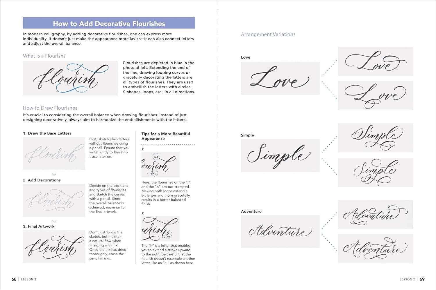
6. Embellishments and Flourishes: Adding Elegance to Your Lettering
Embellishments and flourishes are the decorative elements that add elegance and personality to your lettering. They can range from simple swashes to intricate designs, transforming ordinary lettering into stunning works of art.
6.1 Understanding Embellishments and Flourishes
- Embellishments: Decorative additions to letterforms, such as serifs, shadows, and highlights.
- Flourishes: Ornamental strokes that extend from the letterforms, adding movement and flair.
6.2 Types of Embellishments and Flourishes
- Swashes: Extended strokes that add a touch of elegance to letters.
- Loops: Circular or oval strokes that add movement and flow.
- Tails: Extended strokes that trail off from the letterforms.
- Ornaments: Small decorative elements, such as dots, stars, and hearts.
- Frames: Borders that enclose the lettering, adding a sense of structure and formality.
- Banners: Decorative strips that hold words or phrases, adding a festive touch.
- Shadows: Creating depth and dimension.
6.3 How to Add Embellishments and Flourishes
- Start with the Letterforms: Ensure that your letterforms are well-constructed and consistent before adding embellishments.
- Choose Appropriate Embellishments: Select embellishments that complement the style of your lettering and the overall design.
- Practice on Tracing Paper: Practice adding embellishments on tracing paper before applying them to your final piece.
- Start Simple: Begin with simple embellishments and gradually work your way up to more complex designs.
- Balance and Symmetry: Pay attention to balance and symmetry when adding embellishments.
- Use Light Pressure: Use light pressure when adding flourishes to create delicate and flowing strokes.
- Vary the Thickness: Vary the thickness of your strokes to add visual interest.
- Leave Space: Leave enough space between the letterforms to allow the embellishments to breathe.
6.4 Tips for Success
- Study Examples: Study examples of well-embellished lettering and analyze the techniques used.
- Use a Light Hand: Avoid overdoing the embellishments. Less is often more.
- Consider the Context: Choose embellishments that are appropriate for the occasion and the overall message.
- Experiment with Colors: Use different colors to add visual interest to your embellishments.
- Be Creative: Don’t be afraid to experiment and develop your own unique style of embellishment.
By mastering the art of embellishments and flourishes, you can elevate your lettering to new heights and create stunning works of art. Conduct.edu.vn offers a gallery of embellished lettering for inspiration, as well as tutorials on how to create various types of embellishments.
7. Composition and Layout: Arranging Your Lettering
Composition and layout are essential elements of effective lettering. They determine how your lettering is arranged on the page, creating a visually appealing and balanced design.
7.1 Understanding Composition and Layout
- Composition: The arrangement of elements within a design.
- Layout: The overall structure and organization of a design.
7.2 Principles of Composition
- Balance: Creating a sense of equilibrium in the design.
- Contrast: Using differences in size, color, and shape to create visual interest.
- Hierarchy: Establishing a clear order of importance among the elements.
- Emphasis: Drawing attention to the most important element in the design.
- Unity: Creating a sense of harmony and coherence in the design.
- Rhythm: Creating a sense of movement and flow in the design.
- Proportion: Ensuring that the elements are in proper scale to each other.
- White Space: Using empty space to create visual breathing room and enhance readability.
7.3 Layout Techniques
- Grid Systems: Using a grid to structure the layout and ensure consistency.
- Rule of Thirds: Dividing the page into thirds horizontally and vertically, and placing key elements at the intersections.
- Symmetry: Creating a balanced design by mirroring elements on either side of a central axis.
- Asymmetry: Creating a dynamic design by placing elements off-center.
- Radial Layout: Arranging elements around a central point.
- Curvilinear Layout: Using curved lines to create a sense of flow and movement.
7.4 How to Plan Your Lettering Composition
- Determine the Message: Identify the key message you want to convey.
- Sketch Ideas: Experiment with different layouts and compositions on paper.
- Consider the Space: Take into account the size and shape of the paper or canvas.
- Establish Hierarchy: Decide which elements should be most prominent.
- Create a Focal Point: Identify a focal point that will draw the viewer’s attention.
- Use White Space: Leave enough white space to create visual breathing room.
- Refine the Layout: Make any necessary adjustments to improve the balance and visual appeal of the composition.
7.5 Tips for Success
- Study Examples: Study examples of well-composed lettering and analyze the techniques used.
- Use a Sketchbook: Keep a sketchbook to experiment with different layouts and compositions.
- Get Feedback: Ask for feedback from other artists or designers.
- Be Open to Experimentation: Don’t be afraid to try new things and push your creative boundaries.
- Trust Your Instincts: Ultimately, the best composition is the one that feels right to you.
By mastering the principles of composition and layout, you can create lettering that is both visually appealing and effective in communicating your message. Conduct.edu.vn offers a gallery of well-composed lettering for inspiration, as well as tutorials on how to create various types of layouts.
8. Adding Color and Texture: Enhancing Your Lettering
Color and texture can add depth, dimension, and visual interest to your lettering, transforming it from simple black and white to vibrant and engaging artwork.
8.1 Understanding Color and Texture
- Color: The visual perception of different wavelengths of light.
- Texture: The surface quality of an object, such as smooth, rough, or bumpy.
8.2 Color Theory Basics
- Hue: The pure color, such as red, blue, or green.
- Saturation: The intensity or purity of a color.
- Value: The lightness or darkness of a color.
- Color Wheel: A visual representation of the relationships between colors.
- Primary Colors: Red, yellow, and blue.
- Secondary Colors: Green, orange, and violet (created by mixing primary colors).
- Tertiary Colors: Colors created by mixing a primary color with a secondary color.
- Complementary Colors: Colors that are opposite each other on the color wheel (e.g., red and green).
- Analogous Colors: Colors that are next to each other on the color wheel (e.g., blue, blue-green, and green).
- Color Harmony: Creating visually pleasing color combinations.
8.3 Techniques for Adding Color
- Brush Pens: Use brush pens in various colors to create vibrant lettering.
- Watercolor: Use watercolor paints to create soft and ethereal effects.
- Markers: Use markers to add bold and saturated colors.
- Colored Pencils: Use colored pencils to create subtle and textured effects.
- Digital Coloring: Use digital tools to add color to your lettering.
8.4 Techniques for Adding Texture
- Paper Texture: Use textured paper to add a tactile feel to your lettering.
- Layering: Layer different colors and textures to create depth and dimension.
- Splattering: Use a brush to splatter ink or paint onto the paper.
- Dry Brushing: Use a dry brush to create a scratchy and textured effect.
- Salt Technique: Sprinkle salt onto wet watercolor paint to create a unique texture.
- Digital Textures: Use digital tools to add textures to your lettering.
8.5 How to Choose Colors and Textures
- Consider the Mood: Choose colors and textures that evoke the desired mood or feeling.
- Use a Color Palette: Create a color palette to ensure harmony and consistency.
- Experiment with Combinations: Try different color and texture combinations to see what works best.
- Look for Inspiration: Find inspiration in nature, art, and design.
- Trust Your Instincts: Choose colors and textures that you find visually appealing.
8.6 Tips for Success
- Start Simple: Begin with a limited color palette and simple textures.
- Use High-Quality Materials: Invest in high-quality paints, inks, and papers.
- Practice Regularly: Experiment with different techniques and materials to develop your skills.
- Study Examples: Study examples of lettering that effectively use color and texture.
- Don’t Be Afraid to Experiment: Try new things and push your creative boundaries.
By mastering the art of color and texture, you can add depth, dimension, and visual interest to your lettering, creating stunning and engaging artwork. conduct.edu.vn offers a gallery of lettering that effectively uses color and texture for inspiration, as well as tutorials on how to create various color and texture effects.
9. Practical Applications: Lettering in Real-World Projects
Now that you’ve acquired the essential skills and techniques, it’s time to explore the practical applications of lettering in real-world projects. Lettering can add a personal and artistic touch to a wide range of creative endeavors, from stationery and invitations to logos and artwork.
9.1 Stationery and Invitations
Lettering can transform ordinary stationery and invitations into personalized and memorable keepsakes.
- Wedding Invitations: Create elegant and unique wedding invitations with custom lettering.
- Greeting Cards: Design heartfelt greeting cards for birthdays, holidays, and other special occasions.
- Thank You Notes: Add a personal touch to thank you notes with hand-lettered messages.
- Place Cards: Create stylish place cards for dinner parties and events.
- Envelopes: Address envelopes with beautiful calligraphy for a touch of elegance.
9.2 Logos and Branding
Lettering can add a distinctive and memorable touch to logos and branding materials.
- Logo Design: Create unique and eye-catching logos with custom lettering.
- Business Cards: Design stylish business cards with hand-lettered contact information.
- Website Headers: Add visual interest to website headers with custom lettering.
- Social Media Graphics: Create engaging social media graphics with hand-lettered quotes and messages.
- Packaging Design: Design attractive packaging with custom lettering for product labels and boxes.
9.3 Art and Décor
Lettering can be used to create stunning works of art and décor for your home or office.
- Wall Art: Create inspirational wall art with hand-lettered quotes and messages.
- Canvas Art: Design unique canvas art with custom lettering and illustrations.
- Home Décor: Add a personal touch to your home décor with hand-lettered signs and banners