Typography is the art and technique of arranging type to make written language legible, readable, and appealing when displayed. CONDUCT.EDU.VN offers this comprehensive guide to typography basics, covering essential terms, font styles, file types, figures, symbols, and typesetting details, providing solutions to common challenges in typography. Mastering these foundations will significantly enhance your design skills, ensuring your message is conveyed effectively and beautifully using graphic design typography.
1. Understanding Typeface vs Font
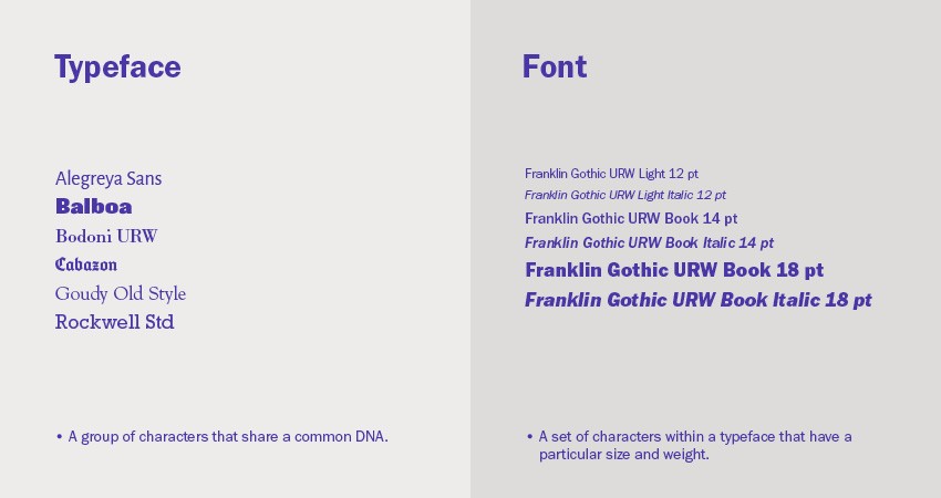
The terms “typeface” and “font” are often used interchangeably, but they have distinct meanings. Understanding the difference is fundamental to typography basics.
- A typeface is a family of related fonts. Think of it as a design concept or a set of unified design characteristics that define a group of letters, numbers, and symbols. Examples include Helvetica, Times New Roman, and Arial.
- A font is a specific variation of a typeface, defining a particular weight, style, or size. For example, Helvetica Bold 12pt is a font, while Helvetica Italic 10pt is another. Both belong to the Helvetica typeface.
To further clarify, consider this analogy: A typeface is like a family of dogs (e.g., Retrievers), while a font is a specific member of that family (e.g., a Golden Retriever puppy). While both are Retrievers, they have distinct characteristics. This understanding is crucial for anyone delving into graphic design typography.
2. Exploring Font Styles
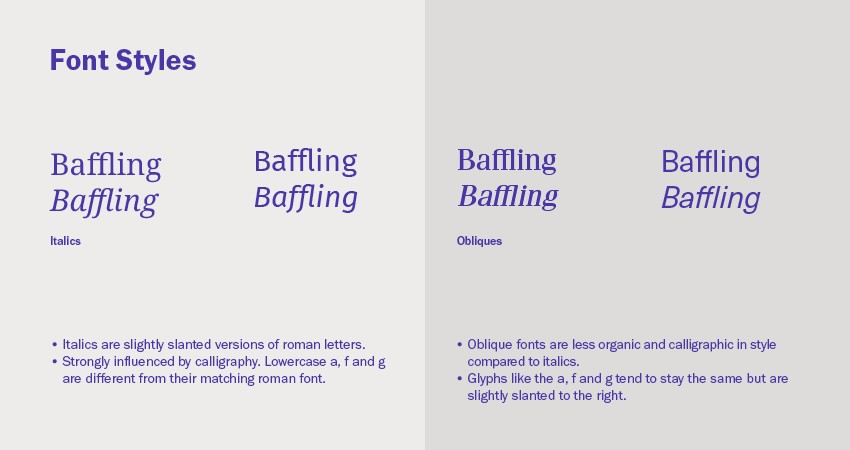
Font styles add flavor and emphasis to your text. They are variations of a typeface that offer different visual appearances. Understanding these styles is crucial for effective communication through graphic design typography.
- Italics: These are slanted versions of a typeface, often used for emphasis, titles of works, or foreign words. True italics are specifically designed to complement the Roman (regular) version of the typeface, often with distinct letterforms.
- Oblique: Similar to italics, obliques are also slanted, but they are typically a mechanically slanted version of the Roman typeface, without significant design changes.
- Roman (Regular): This is the standard, upright version of a typeface. It forms the foundation for most text and provides the neutral base from which other styles are derived.
The choice of font style can greatly impact the tone and readability of your text. Italics add a touch of elegance, while obliques provide a more subtle emphasis. Roman provides the stability and clarity needed for extended reading.
3. Deciphering Font Weights
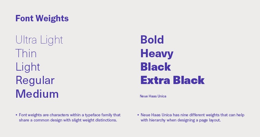
Font weight refers to the thickness of a typeface’s strokes, influencing its visual impact and readability. Utilizing different weights is essential for creating visual hierarchy and emphasis.
Common font weights include:
- Light: A thin, delicate weight, suitable for elegant designs and headings where subtlety is desired.
- Regular (Normal): The standard weight of a typeface, used for body text and general applications.
- Medium: A weight between regular and bold, offering a slightly stronger visual presence.
- Bold: A heavy weight, used for emphasis, headings, and drawing attention to specific elements.
- Black (Heavy): The thickest weight, used for maximum impact and prominence.
By strategically varying font weights, designers can guide the reader’s eye, establish a clear hierarchy, and add visual interest to their designs. For example, headings might use a bold weight to stand out, while body text uses a regular weight for readability.
4. Navigating Font File Types
Choosing the correct font file type is crucial for ensuring compatibility and quality across different platforms and applications. Understanding the distinctions between file types can prevent headaches and ensure your typography looks its best.
Here’s a breakdown of common font file types:
| File Type | Extension | Description |
|---|---|---|
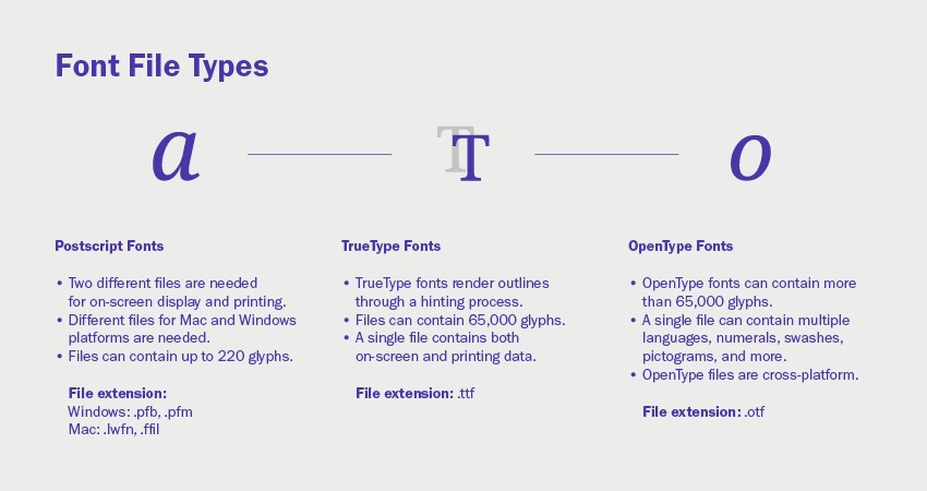
| PostScript | .pfb, .pfm | An older format developed by Adobe, requiring separate files for screen display and printing. Can hold a maximum of 220 glyphs. |
| TrueType Font | .ttf | Developed by Apple and Microsoft, incorporating hinting for improved legibility on low-resolution devices. Contains up to 65,000 glyphs. |
| OpenType Font | .otf | A cross-platform format developed by Adobe and Microsoft, supporting Unicode and containing over 65,000 glyphs, including swashes and ligatures. |
| Web Open Font Format | .woff, .woff2 | Optimized for use on websites, offering compression and additional metadata for efficient delivery and rendering. |
OpenType (.otf) is generally the preferred format due to its cross-platform compatibility, extensive character support, and advanced typographic features. WOFF and WOFF2 are essential for web design, ensuring fonts load quickly and display correctly in different browsers.
5. Understanding Figures, Signs, and Symbols
Typography extends beyond letters to include a variety of figures, signs, and symbols, each with specific purposes and design considerations. Understanding these elements is crucial for polished and professional typography.
5.1. Old Style, Lining, Proportional, and Tabular Figures
Different numeral styles offer varying aesthetics and functionalities. Choosing the appropriate style enhances readability and visual harmony in different contexts.
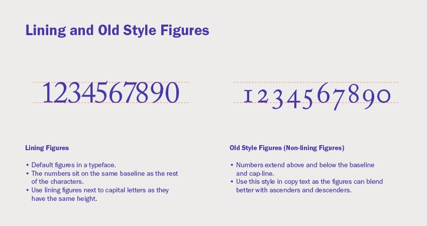
- Lining Figures: These figures align with the cap height and baseline, creating a uniform appearance. They are well-suited for use with capital letters and in contexts where a consistent height is desired.
- Old Style Figures: Also known as non-lining figures, these numerals have ascenders and descenders, blending seamlessly with lowercase text. They are ideal for body text where a more organic and less obtrusive appearance is preferred.
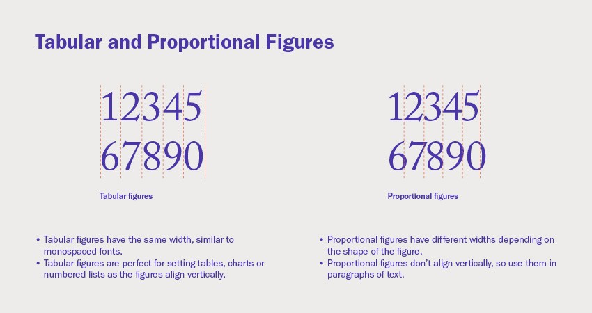
- Tabular Figures: These figures have a fixed width, ensuring vertical alignment in tables, charts, and lists. Their consistent width prevents numbers from appearing misaligned in columns.
- Proportional Figures: These figures have varying widths depending on their shape, making them suitable for use in body text where a natural and flowing appearance is desired.
5.2. Superscript and Subscript
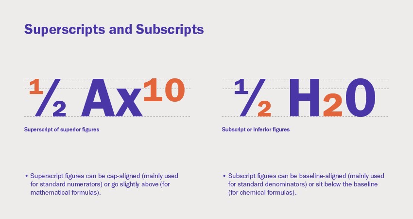
Superscript and subscript characters are smaller versions of numerals, positioned above or below the baseline. They serve specific purposes in footnotes, scientific notations, and mathematical expressions.
- Superscripts: These characters are positioned above the baseline, commonly used for footnotes, exponents, and ordinal indicators (e.g., 1st, 2nd, 3rd).
- Subscripts: These characters are positioned below the baseline, typically used in chemical formulas (e.g., H₂O) and mathematical notations.
Properly designed superscript and subscript figures maintain harmonious visual proportions with the surrounding text. Software like InDesign can create synthetic versions, but dedicated glyphs within a typeface offer superior quality and aesthetics.
5.3. Small Caps
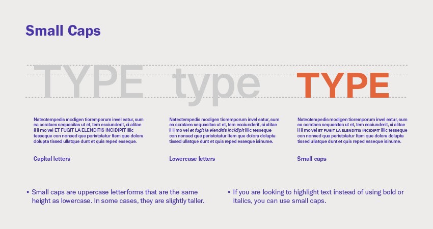
Small caps are uppercase letterforms that are shorter than regular capital letters, typically matching the x-height of the lowercase letters. They offer a subtle way to emphasize text without the visual weight of full capitals.
Small caps are often used in:
- Headings and subheadings
- Acronyms and abbreviations
- Stylistic variations within body text
Avoid using software-generated small caps, as they are simply scaled-down versions of regular capitals and often appear too light and poorly spaced. True small caps are specifically designed to maintain proper proportions and weight.
5.4. Ligatures: Standard and Discretionary
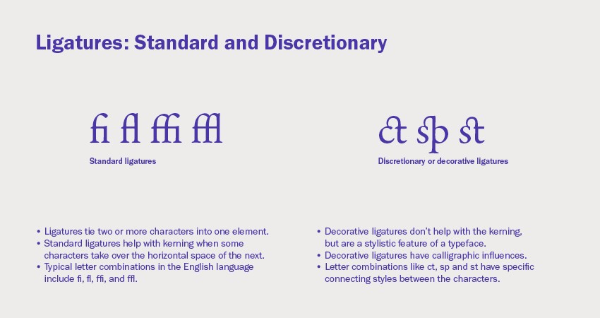
Ligatures are special characters that combine two or more letters into a single glyph. They improve readability and aesthetics by resolving awkward spacing or overlapping issues.
- Standard Ligatures: These ligatures address common kerning problems, such as the overlapping of the letters “f” and “i” (fi), “f” and “l” (fl), “f,” “f,” and “i” (ffi), and “f,” “f,” and “l” (ffl).
- Discretionary Ligatures: These ligatures are stylistic and decorative, adding character and flair to the typeface. They may combine letters like “ct,” “st,” or “sp” in unique and visually appealing ways.
Ligatures enhance the overall polish and sophistication of typography, particularly in display settings and branding.
5.5. Hyphens and Dashes
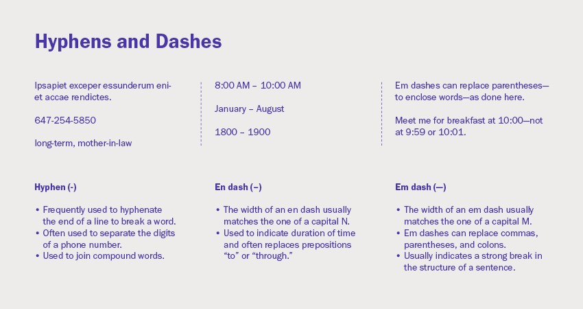
Hyphens and dashes are horizontal strokes that serve different punctuation purposes. Understanding their proper usage is essential for clear and accurate writing.
- Hyphen (-): Used to join words (e.g., “long-term”), break words at the end of a line, and separate digits in phone numbers.
- En Dash (–): Slightly longer than a hyphen, used to indicate a range or duration (e.g., “2020–2023”) or to connect related words (e.g., “pre–World War II”).
- Em Dash (—): The longest dash, used to indicate a sudden break in thought, to set off parenthetical information, or as a substitute for commas or colons.
Using the correct dash enhances the clarity and professionalism of your writing.
5.6. Ampersand (&)
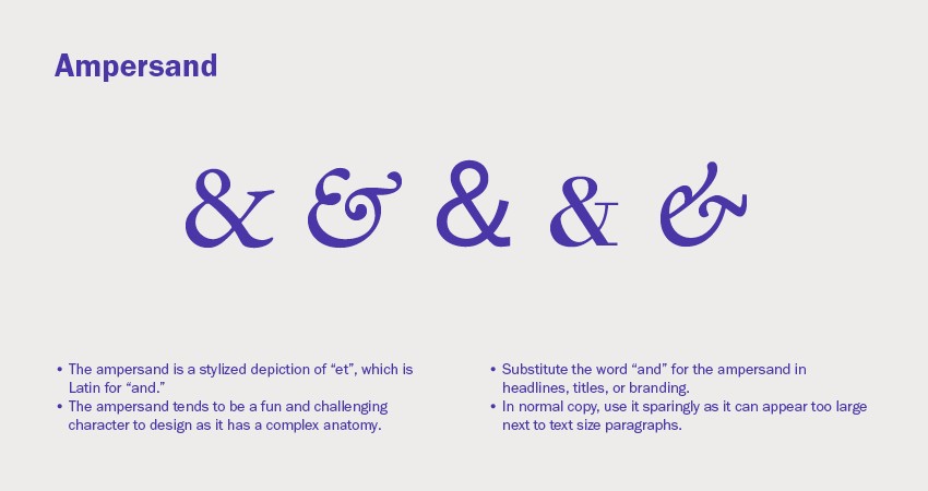
The ampersand is a stylized representation of the Latin word “et,” meaning “and.” It’s often used in place of the word “and” in headlines, titles, and branding where a more concise or decorative appearance is desired.
Ampersands can vary significantly in design, adding character and personality to a typeface. However, they should be used sparingly in body text, as they can appear visually disruptive.
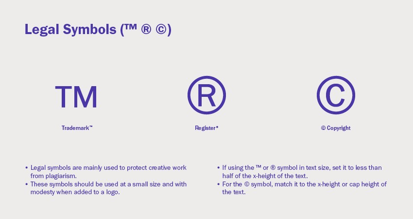
5.7. Legal Symbols (™ ® ©)
Trademark (™), registered trademark (®), and copyright (©) symbols are essential for protecting intellectual property. They should be used appropriately and with consideration for visual harmony.
- Trademark (™): Indicates that a brand name or logo is claimed as a trademark.
- Registered Trademark (®): Indicates that a trademark has been officially registered with a government agency.
- Copyright (©): Protects original works of authorship, including text, images, and software.
These symbols are typically used in a small size, often with sans-serif fonts for better readability. The copyright symbol should generally match the x-height or cap height of the surrounding text, while trademark and registered trademark symbols can be slightly smaller.
6. Achieving Detailed Typography
Beyond the individual elements of type, achieving effective typography requires attention to detail in areas such as legibility, readability, size, line length, leading, tracking, kerning, alignment, rags, rivers, orphans, and widows.
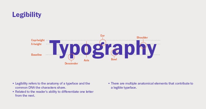
6.1. Legibility
Legibility refers to the ease with which individual characters can be distinguished from one another. It depends on factors such as:
- X-height: The height of the lowercase letters relative to the cap height.
- Character width: The horizontal space occupied by each character.
- Weight: The thickness of the strokes.
- Counters: The enclosed spaces within letters.
- Serifs: The small decorative strokes at the ends of letterforms.
- Stroke contrast: The variation in thickness between different parts of a letter.
A highly legible typeface ensures that readers can quickly and accurately recognize each letter, reducing cognitive strain and improving the overall reading experience.
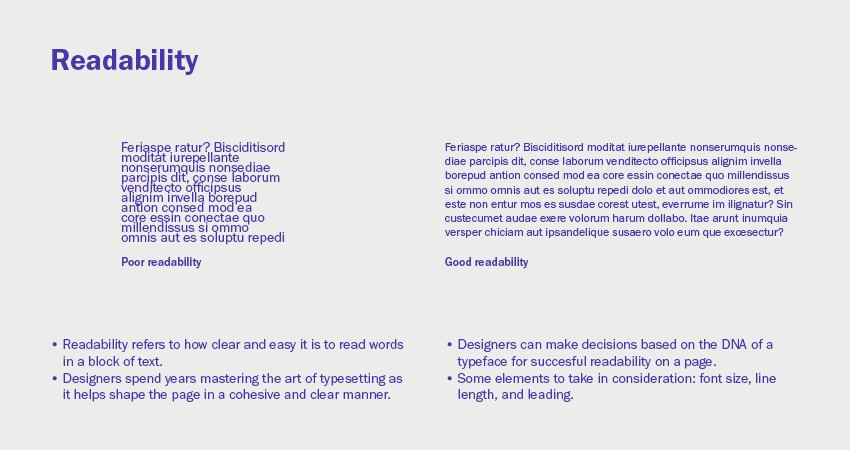
6.2. Readability
Readability refers to the ease with which a block of text can be read and understood. It depends on factors such as:
- Font size: The overall size of the text.
- Line length: The width of the text column.
- Leading (line spacing): The vertical space between lines of text.
- Tracking (letter spacing): The horizontal space between characters.
- Kerning: The adjustment of space between specific pairs of letters.
- Typographic alignment: The arrangement of text on the page.
Readability is influenced by how these elements work together to create a comfortable and inviting reading experience. A highly readable text encourages readers to engage with the content and comprehend the message effectively.
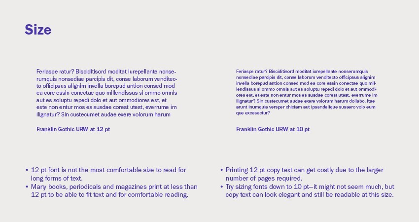
6.3. Size
Font size plays a critical role in readability and visual impact. While 12pt is a common default size, it’s not always the most appropriate. Consider the following:
- Context: Business cards often use 7-8pt, while books and magazines may use 10-12pt.
- Typeface: Different typefaces have different apparent sizes at the same point size.
- Readability: Experiment with sizes to find the most comfortable reading experience.
Adjusting the font size by even 0.25pt or 0.5pt can significantly impact the overall appearance and readability of the text.
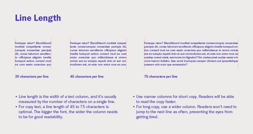
6.4. Line Length
Line length is the width of a column of text, typically measured in characters per line. Optimal line length enhances readability by preventing eye strain and improving rhythm.
- General guideline: Aim for 45-75 characters per line for body text.
- Shorter lines: Suitable for narrow columns and shorter blocks of text.
- Longer lines: Suitable for wider columns and extended reading.
Adjust line length based on font size and the overall design of the page.
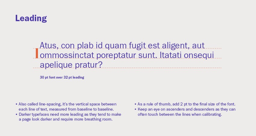
6.5. Leading
Leading, or line spacing, is the vertical distance between baselines of text. It affects readability and visual density.
- General guideline: Add 2pt to the font size for comfortable leading (e.g., 12pt font with 14pt leading).
- Darker typefaces: May require more leading to increase white space and improve readability.
- Ascenders and descenders: Ensure that ascenders and descenders from adjacent lines do not touch.
Proper leading creates a balanced and inviting reading experience.
6.6. Tracking
Tracking, or letter spacing, is the uniform adjustment of space between all characters in a block of text. It can improve readability and visual appeal.
- Lowercase text: May require slight tracking to improve rags and eliminate orphans and widows.
- Capital letters: Often benefit from tracking to add air between characters.
Avoid excessive tracking, as it can negatively impact readability and create a disjointed appearance.
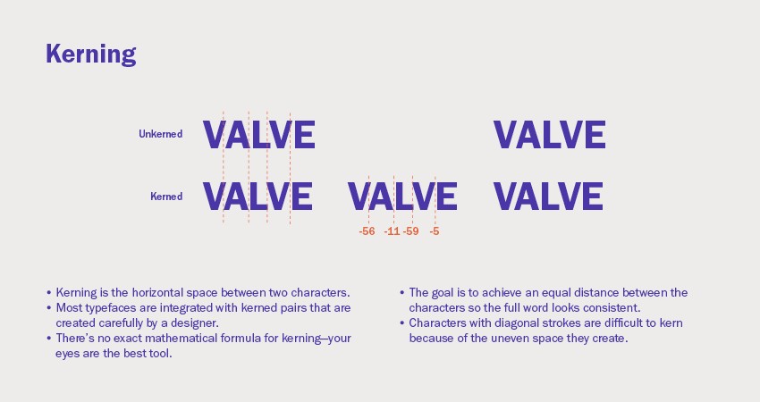
6.7. Kerning
Kerning is the adjustment of space between specific pairs of letters to achieve visually consistent spacing. It improves the overall appearance and readability of text.
- Kerned pairs: Most typefaces include built-in kerned pairs, but manual adjustments may be necessary.
- Diagonal strokes: Characters with diagonal strokes (e.g., “AV,” “WA”) often require kerning.
- Visual balance: The goal is to create an even distribution of space between letters, avoiding gaps or crowding.
Kerning is a subtle but essential aspect of professional typography.
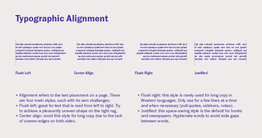
6.8. Typographic Alignment
Typographic alignment refers to the placement of text on a page. The four main alignment styles are:
- Flush Left (Ragged Right): The most common alignment for body text, offering a natural and readable flow.
- Center Align: Suitable for short blocks of text, headlines, and invitations.
- Flush Right (Ragged Left): Used sparingly, often in right-to-left languages or for specific design elements.
- Justified: Aligned on both left and right margins, often used in books and newspapers.
Each alignment style has its own applications and challenges. Flush left is generally the most readable, while justified requires careful hyphenation to avoid unsightly gaps.
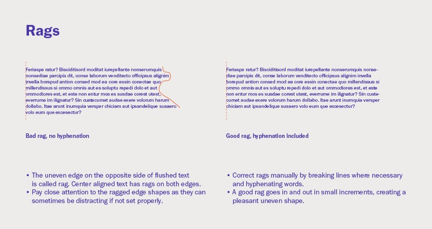
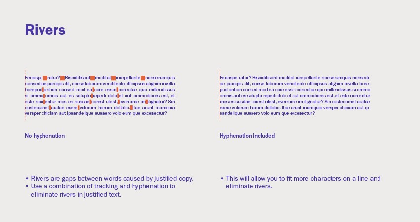
6.9. Rags and Rivers
Rags refer to the uneven edge of text in flush left, flush right, or center-aligned text. Rivers are unsightly gaps between words in justified text.
- Rags: Aim for a balanced and subtle rag, avoiding long or distracting lines.
- Rivers: Eliminate rivers by adjusting tracking, hyphenation, and word spacing.
Addressing rags and rivers improves the visual appeal and readability of text.
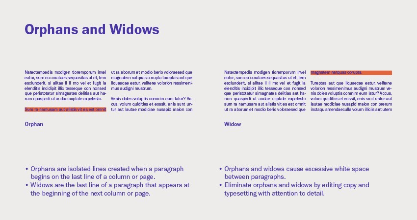
6.10. Orphans and Widows
Orphans are single lines of text at the bottom of a column or page, while widows are single lines of text at the top of a column or page. Both disrupt the flow of reading and should be avoided.
- Eliminate orphans and widows: Adjust copy, tracking, and line breaks to keep paragraphs intact.
Addressing orphans and widows creates a more polished and professional typographic presentation.
7. Common Typography Mistakes
Even experienced designers can fall prey to common typography errors. Being aware of these pitfalls can help you avoid them and elevate your work.
| Mistake | Description | Solution |
|---|---|---|
| Using too many typefaces | Creates a cluttered and confusing design | Limit yourself to 2-3 typefaces per project |
| Poor kerning | Uneven spacing between letters makes text difficult to read | Adjust kerning manually to achieve visual consistency |
| Inconsistent leading | Inconsistent line spacing disrupts the flow of reading | Maintain consistent leading throughout the text |
| Neglecting hierarchy | Failing to establish a clear visual hierarchy makes it difficult for readers to scan the text | Use different font sizes, weights, and styles to create a clear hierarchy |
| Ignoring readability | Choosing overly decorative or complex fonts makes text difficult to read | Prioritize legibility and readability when selecting fonts |
| Using default settings | Relying on default settings without adjusting them can lead to subpar typography | Experiment with different settings to find the optimal combination for your project |
| Improper use of hyphens/dashes | Using hyphens and dashes incorrectly can confuse readers | Understand the distinctions between hyphens, en dashes, and em dashes, and use them appropriately |
| Scaling small caps | Scaling down regular capitals to create small caps results in poorly proportioned letterforms | Use true small caps, which are specifically designed to maintain proper proportions and weight |
| Overuse of bold/italics | Excessive use of bold or italics can diminish their impact and make text appear cluttered | Use these styles sparingly and strategically to emphasize key elements |
| Neglecting accessibility | Failing to consider the needs of visually impaired readers can exclude a significant portion of your audience | Use sufficient contrast, avoid small font sizes, and provide alternative text for images |
8. Typography Resources and Tools
Mastering typography requires continuous learning and experimentation. Here are some valuable resources and tools to help you on your journey:
- Books:
- “The Elements of Typographic Style” by Robert Bringhurst
- “Thinking with Type” by Ellen Lupton
- “Stop Stealing Sheep & Find Out How Type Works” by Erik Spiekermann
- Websites:
- CONDUCT.EDU.VN: Offers a wide range of articles and guides on typography and design ethics.
- Typewolf: Features real-world examples of typography in use, along with font recommendations.
- Fonts in Use: Showcases the use of different typefaces in various design projects.
- Tools:
- Font editors (e.g., Glyphs, RoboFont): Allow you to create and customize your own typefaces.
- Online kerning games (e.g., Kern Type): Help you develop your kerning skills.
- Color contrast checkers: Ensure sufficient contrast between text and background for readability.
9. The Importance of Typography in Design
Typography is more than just selecting fonts; it’s a critical element of visual communication that impacts how your message is received and understood. Effective typography:
- Enhances readability: Makes text easy to read and comprehend.
- Establishes hierarchy: Guides the reader’s eye and emphasizes key information.
- Creates visual appeal: Adds aesthetic value and enhances the overall design.
- Communicates tone: Conveys the intended mood and personality.
- Reinforces branding: Creates a consistent and recognizable brand identity.
By mastering typography basics, designers can create compelling and effective visual communications that resonate with their audience.
10. Staying Updated with Typography Trends
Typography, like any design field, is constantly evolving. Keeping abreast of current trends can help you create fresh and relevant designs. Some current trends include:
- Variable fonts: Offer flexibility and customization options.
- Bold and expressive typography: Creates impactful and attention-grabbing designs.
- Retro and vintage styles: Evoke nostalgia and add character.
- Handwritten and script fonts: Add a personal and authentic touch.
- Geometric and minimalist fonts: Offer a clean and modern aesthetic.
However, remember that trends come and go. The key is to understand the principles of good typography and apply them in a way that aligns with your design goals and target audience.
FAQ: Typography Basics
- What is the difference between a serif and sans-serif typeface? Serif typefaces have small decorative strokes (serifs) at the ends of letterforms, while sans-serif typefaces do not.
- What is kerning, and why is it important? Kerning is the adjustment of space between specific pairs of letters to achieve visually consistent spacing. It improves readability and visual appeal.
- What is leading, and how does it affect readability? Leading is the vertical space between baselines of text. Proper leading enhances readability by creating a comfortable and inviting reading experience.
- What is tracking, and when should I use it? Tracking is the uniform adjustment of space between all characters in a block of text. It can be used to improve rags, eliminate orphans and widows, and add air between capital letters.
- What is the ideal line length for body text? Aim for 45-75 characters per line for optimal readability.
- What are orphans and widows, and how can I avoid them? Orphans are single lines of text at the bottom of a column or page, while widows are single lines of text at the top of a column or page. Adjust copy, tracking, and line breaks to avoid them.
- What is the difference between a hyphen, an en dash, and an em dash? A hyphen joins words, an en dash indicates a range or duration, and an em dash indicates a break in thought or sets off parenthetical information.
- What are ligatures, and why are they used? Ligatures are special characters that combine two or more letters into a single glyph. They improve readability and aesthetics by resolving awkward spacing or overlapping issues.
- How many typefaces should I use in a single design? Limit yourself to 2-3 typefaces per project to avoid a cluttered and confusing design.
- How can I improve my typography skills? Study typography resources, practice kerning and typesetting, and experiment with different font combinations and styles.
Navigating the world of typography can be overwhelming, but with the right guidance, it becomes an accessible and rewarding skill. At CONDUCT.EDU.VN, we understand the challenges in finding reliable information and applying it effectively. That’s why we offer in-depth resources, clear explanations, and practical examples to help you master typography basics.
Are you struggling to find reliable information on typography or unsure how to apply these principles in your designs? Visit conduct.edu.vn for comprehensive guides, expert advice, and practical tips. Let us help you transform your designs from ordinary to extraordinary. Contact us at 100 Ethics Plaza, Guideline City, CA 90210, United States. Whatsapp: +1 (707) 555-1234.
