Defining Base and Highlight Colors
The key to a well-coordinated wardrobe lies in understanding the difference between base and highlight colors. Think of base colors as the foundation upon which your style is built, and highlight colors as the accents that add personality and flair.
Base Colors: The Foundation of Your Wardrobe
Base colors are your timeless essentials – the shades that transcend seasons and form the core of your wardrobe. These are the workhorses you can rely on year after year. Classic examples include:
- Black
- White
- Navy
- Beige
- Tan
- Camel
- Khaki
However, base colors are not a rigid set of rules. If red is a staple in your daily attire, then incorporate it as a base color. The most important aspect is choosing colors that reflect your personal style and are versatile enough to mix and match effortlessly.
Highlight Colors: Adding Personality and Seasonal Flair
Highlight colors are where you inject personality and stay on top of seasonal trends. These are essentially any shades outside your base color spectrum. They are perfect for adding pops of color and refreshing your wardrobe.
Once you have a collection of well-fitting base-colored essentials, you can strategically introduce a few highlight pieces each season. These additions breathe new life into your basics and create fresh, exciting outfits. Consider color combinations to ensure highlight colors complement the existing base colors.
Experimenting with Colors: Finding Your Perfect Combinations
Once you’ve defined your base and highlight colors, the real fun begins – experimenting with different combinations. While there are no hard and fast rules, these formulas offer a solid starting point for exploring new and exciting color pairings.
Color Blocking: Simplicity and Boldness
Color blocking involves pairing solid-colored items to create striking contrasts. The key is to stick to two main colors per outfit (excluding black and white, which can act as neutrals). This formula creates a put-together look with minimal effort. Think colored shorts paired with a neutral top or a silk shirt layered under a leather jacket.
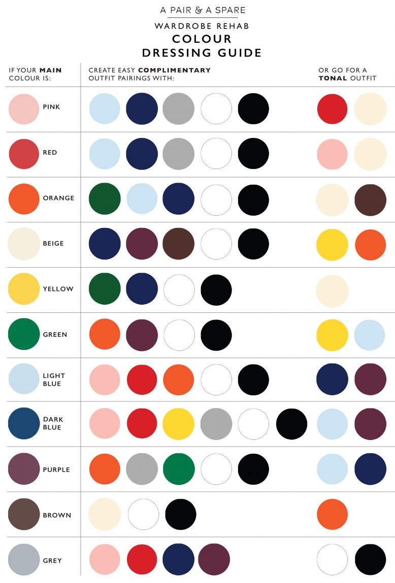
Tonal Dressing: Subtle Sophistication
Tonal dressing revolves around layering different shades of the same color within a single outfit. This technique requires a variety of shades within your chosen color family. Play with contrast by combining lighter and darker shades, or incorporate black and white accessories for added depth.
Print Matching: Extracting Colors From Patterns
Prints with multiple colors can seem daunting, but the solution is simple: extract colors from the print and use them in other parts of your outfit. Choose one or two colors from the print to match with other garments or accessories. This simplifies the overall palette and ties the look together.
Ultimately, experimenting with colors should be an enjoyable process. Prioritize colors that complement your skin tone and make you feel confident, rather than blindly following trends.
Minimalism and Color: Can They Coexist?
If your goal is a minimalist wardrobe, does that mean banishing color altogether? Not necessarily. Minimalism is about intentionality, not deprivation. You can still embrace color while curating a minimalist wardrobe. The key is to carefully select colors that you love and that seamlessly integrate into your existing closet. Consider the emotional impact of colors and choose those that make you feel good. A minimalist wardrobe can be vibrant and expressive, as long as each color is carefully chosen and intentionally incorporated.
By following this “a pair and a spare color dressing guide”, you can transform your wardrobe into a collection of thoughtfully curated pieces that reflect your personal style and make getting dressed a joy.