Design systems and style guides are often used interchangeably, but understanding their distinct roles is crucial in UX design. While related, they serve different purposes and operate at different levels of complexity. This article explores “what is a style guide in UX,” its relationship to design systems, and its importance in creating consistent and effective user experiences.
Design Systems and Style Guides: A Parent-Child Relationship
Both design systems and style guides provide guidelines, principles, and visual references for creating interfaces and other designs within a company, product, or service. They enable UX professionals and developers to design and develop with visual consistency, a feat that would be challenging to achieve and maintain at scale without them.
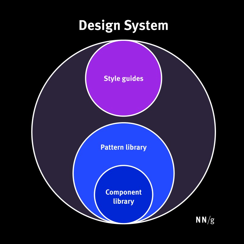
The key difference lies in their scope and complexity. Think of them as having a parent-child relationship. The design system is the “parent,” encompassing various smaller components, including style guides. Style guides, pattern libraries, and component libraries are the “children” that collectively form a larger design system.
| Design System | Style Guide | |
|---|---|---|
| Definition | A complete set of standards intended to manage design at scale using reusable components and patterns | A piece of documentation that contains specific guidelines, visual references, and design principles |
| Scope | Broad and holistic: Covers all aspects of design and development from visual style to UI patterns and code implementation | Narrow and focused: Each style guide focuses on a specific aspect of the experience design (such as visual design, content, or branding) ensuring that all elements adhere to a consistent style |
Diving Deeper into Design Systems
A design system is a living, complete set of standards intended to manage design at scale using reusable components and patterns.
The primary goal of a design system is to ensure consistent design across an organization and reduce redundancy by eliminating duplicated design elements and patterns. Without a design system, large organizations often create and code multiple versions of the same design element, resulting in internal inconsistency, wasted time, and messy code. Design systems also establish a shared design language among design and development teams, as well as across different departments within a company, fostering collaboration and understanding.
For instance, consider two design teams in different departments of the same company. Both teams can leverage pre-built elements and components from the design system for their respective projects. Even though they don’t directly collaborate, the shared design patterns ensure consistency in the final outputs.
Developers can efficiently code the design by referencing components from the design system, avoiding the need to write code for each element from scratch. Instead, they can simply copy and paste existing code readily available within the design system.
The Design System Repository
A repository is used to house and access the pieces of a design system. This generally takes the form of a website.
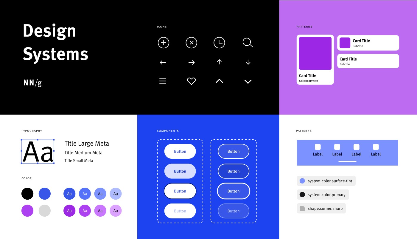
A design system repository typically includes:
- One or more style guides: Offering style guidance on specific needs like brand, content, and visual design.
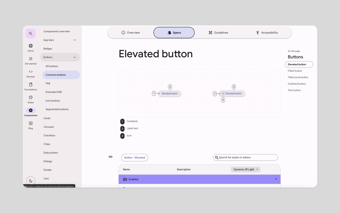
- A component library: Specifying reusable individual UI elements, such as buttons, with detailed design and implementation specifications, including customizable attributes (size, copy), different states (enabled, hover, focus, disabled), and reusable code.
- A pattern library: Specifying reusable patterns, or groups of UI elements from the component library. An example would be a page header composed of a title, breadcrumb, search bar, and primary and secondary buttons.
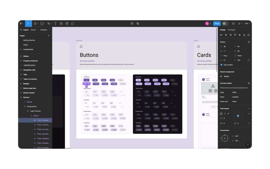
- Additional Resources: Resources such as logos, typefaces and fonts, and icons are usually also included for designers and developers to use. Furthermore, a design file, generally in Figma, is required for designers to effectively use and design with the components and libraries.
It’s important to note that the distinctions between style guides, component libraries, and pattern libraries within a design system can sometimes be unclear. To further complicate matters, organizations may use these terms differently.
Maintaining a Design System
Design systems require ongoing maintenance and oversight to stay current. Therefore, a dedicated team is crucial for managing it.
Larger companies with a strong design focus may have an internal team dedicated to overseeing, creating, and maintaining the design system. Smaller companies, or those with less design maturity, may assign these responsibilities to a senior-level individual contributor.
Understanding Style Guides: The Specifics
A style guide is a piece of documentation that contains specific implementation guidelines, visual references, and design principles for creating interfaces or other designs.
As the name suggests, style guides offer specific style guidance. Each guide usually focuses on one of three distinct style categories: content, brand, or front-end/visual design.
Content Style Guides
These guides contain content standards and specify writing style. They may also include information about the company’s editorial and publication processes.
Content style guides often specify:
- Tone of voice: How content should be expressed and the emotions it should evoke.
- Grammar and spelling: Guidelines on grammar and spelling variations, such as abbreviations, capitalization, contractions, numbers, dates, or punctuation.
- Formatting styles: Rules around when to use formatting techniques like bolding, subheadings, and bullet points.
Brand Style Guides
These guides define brand-related rules and the foundational elements necessary to define a brand.
Brand style guides include components like:
- Color palettes: Primary and secondary palettes and accessible color combinations.
- Typography: Font family or specific typefaces and recommended HTML elements (e.g., “subheadings should be H2 elements”).
- Logos: Approved logo variations, guidelines on when to use specific logos, wordmarks, or symbols, and additional guidance on logo sizing, spacing, and color requirements.
- Imagery: Guidance on photography, illustration, or video styling.
Front-End (or Visual) Style Guides
Sometimes referred to as visual- and interaction-design standards, front-end style guides contain a modular collection of all elements in a product’s user interface, guidelines for using each element, and code snippets for developers to copy and paste.
Although similar to a pattern or component library, front-end guides serve a different purpose. UX practitioners and developers use them to define broad design ideas, not specific implementation details. They typically take the form of a web page.
A front-end style guide often overlaps with the brand style guide, potentially including elements like colors, typography, and spacing.
Maintaining Style Guides
Like design systems, style guides require a team to create, oversee, and maintain them.
- Brand style guides are typically created by an internal design team or a third-party design or marketing agency. They generally don’t change much once created (unless the company goes through a rebranding project) and, therefore, require minimal maintenance.
- Content style guides are usually created and maintained by the company’s content team, especially content strategists.
- Front-end style guides are typically created and maintained by a UX team with help from the development or engineering team.
Conclusion: Leveraging Design Systems and Style Guides
Design systems are comprised of various elements – components, patterns, styles, and guidelines – which facilitate the operationalization and optimization of design initiatives.
Use design systems to:
- Design and develop work quickly, consistently, and at scale.
- Create a shared design language across teams and departments.
- Reduce redundancy of design patterns.
Style guides are more focused, providing guidelines for use and serving as a key component of a design system. Understanding “what is a style guide in UX” is fundamental for any UX professional.
Use style guides to:
- Establish a cohesive experience across designs.
- Enforce consistency in specific aspects of the experience, such as content or visual design.